Mercator’s map: how a homebody shaped world views
Summary and headline written by AI from the source article. How we work
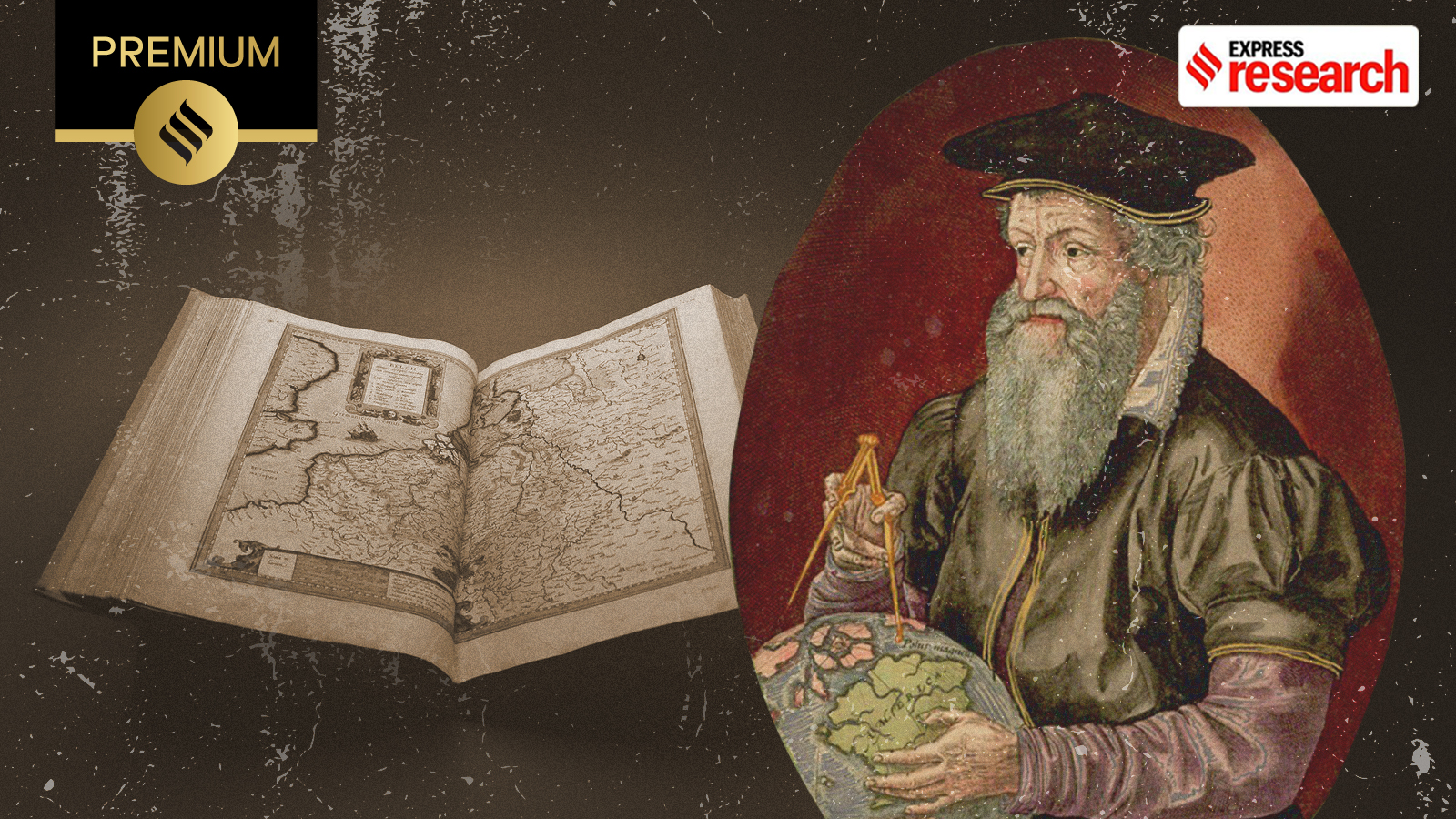
In 1569, Flemish geographer Gerardus Mercator created a world map that solved a longstanding problem for mapmakers, accurately displaying the globe’s curved surface on a flat plane.
Mercator, who spent his entire life within a 200-kilometer radius of his birthplace in Belgium, developed a projection that allowed sailors to draw straight lines representing constant compass headings, simplifying navigation. This “conformal projection” achieved accuracy in angles by spacing latitude lines further apart as they moved from the equator.
The Mercator projection became widely used despite distorting the relative sizes of countries and continents. Greenland appears comparable to South America, while Africa seems smaller than it is. Though criticized for its Eurocentric bias, it visually emphasized Europe and North America, the map remained popular for centuries, influencing maps into the modern digital age. Google Maps and other platforms still utilize variations of Mercator’s design because of its clean, rectangular tiles.
Recently, the UN General Assembly voted to replace the Mercator projection with a more accurate representation of global sizes, a move prompted by concerns over the map’s historical distortions. Despite its flaws, Mercator’s map revolutionized cartography and continues to shape how people visualize the world, remaining the basis for many modern maps over 450 years after its creation. His son, Rumold, published Mercator’s completed atlas in 1595, a year after his death at age 82.